Kerrie Kelly
Kerrie Kelly Design Lab
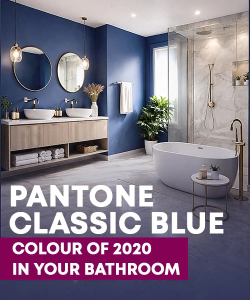
"I like Sherwin Williams Naval or Pantone’s Dress Blues. It is dark and dramatic while also being classic, providing contrast and interest."
Martyn White
Martyn White Designs
"Dark Blue hues soared in popularity last year but I think we have only just touched the surface with their use in the home. I believe that Pantone PQ-2377C is the perfect shade and will be a popular choice for 2018. It combines the right amount of warmth and depth to be used anywhere in the home and only a month in, I already see such an overwhelming response to this colour used in interiors."
Lori Dennis
Lori Dennis, INC.
"Interiors oscillate away from stark modern, toward the ornate and traditional.
Burgundys(Pantone 209c) and Blacks with jewel tone undertones (Pantone 3C) move to the front.
Soft neutrals like Whites, Pinks and Teal Greys continue to be strong, but now as neutral backgrounds. White (Whisper White Pantone 11-0701 TCX), Pink (Pantone 13-1404 Pale Dogwood) and Teal Grey (Pantone PMS 5483), still stay strong."

Joe Human
Designs By Human., Inc
"I am seeing this year be a year of two things... bold colors and then subdued bold colors. With both of these cases, we see our interior projects needing a richer feel mixed with a level of hominess and coziness. We would do this by including a mix and match of several bright colors but in a more pale sense, pastels and moving away from anything primary. Then for the focal areas putting in deep and rich colors like Navy, Purples and Blacks/Grays."
-
Navy Blue
#403F6F
-
Purple Heather
#BBB9D8
-
Black
#000000
-
Cool Gray
#D9D9D6

Nicola Manning
Nicola Manning Design
"The colour I have chosen is Dulux Splinter"

Arjan Nijen Twilhaar
Aiden T
"In general, 2018 will see warmer shades combined with deep colours. A personal favourite is a deep shade of Blush Pink, like Pantone 693U. It is a wonderful colour for furniture pieces like an accent chair, cushions or even a sofa. I have started painting shaker style interior doors in this colour as well and they look amazing. Using natural marbles with these hues as an accent mosaic in a bathroom looks fantastic. This pink works very well with soft tones of Grey, Metals and as a contrast to deeper tones like Teal and Blue."

Dee Elms
Elms Interior Design
"A deep charcoal like Benjamin Moore French Beret #1610 will always be in style, but this year we’re going to punch it up with Sun Valley #350. We feel Interiors in 2018 are craving a bold color that will catch people’s attention but at the same time be warm and playful, yet sophisticated."
-
French Beret
1610
#494D50
-
Sun Valley
350
#E2B24B

Elena Solodovnikova
ML Decor LLC
"I personally started year with Pantone 17-4402 Natural Grey wall and Pantone 19-1725 Tawny Port in the accents around... looks awesome!"
-
17-4402 TCX
#8E918F
-
19-1725 TCX
#5C2C35

Yanic Simard
Toronto Interior Design Group Inc.
"For 2018, we simply won't be able to get enough of Blush Pink. It's quickly emerging into the interior design world offering a grown up, sophisticated look. It's a colour that will unexpectedly tie everything together in your space, in the most unique and elegant way."
"From my work with clients of different ages and tastes, I realized most of them are leaning towards the Millennial Pink in interiors. I am not a ‘pink’ person, but for some reason with the flooring patterns that are very popular, millennial pink seems really fun, fresh, and elegant at the same time. It’s not totally pink, it has a hint of coral. The popularity of Sketch (restaurant) in London by India Mahdavi is the perfect example of the level of acceptance of this color. In Pantone it is the closest to Coral Pink"

Stefania Skrabak
Art • Home • Garden, LLC
"I am very excited for this year's color. In my opinion, the color of the year is this beautiful Rich Cranberry, Mahogany Brown, Pantone color PMS 188. I see this color mixed with bright pops of color for spring/summer and warm neutrals into fall/winter. Working perfectly with fashion and interior trends."
-
17-1545 TCX
#BB4A4D
-
18-1425 TCX
#824D46
-
PMS 188
#7d212b

Jennifer Williams
Creative Style Interior Design
"I'd like to mention two colours for 2018. The first is Black as a carryover from 2017 but embraced even more. It will be used in furniture at all levels of finish but especially matt, in furnishings as well as kitchen and bathroom colour schemes.
The second colour is what I describe as rich Royal Red, a colour to energise and uplift while retaining a sense of grace and elegance. I think people will be looking for this especially through the rest of the very cold winter in the Northern Hemisphere and into Spring and Summer. It will be used in fabrics, wallpapers, rugs, decorative accessories, even on feature pieces of furniture."
-
Black
#000000
-
Royal Red
#BA192E

Sherri Blum
Jack and Jill Interiors, Inc.
"Nursery design typically, but not always- follows the same color choices as standard interior design. And interior design, typically follows fashion with regards to color popularity. When I work with a client to design the nursery, I encourage them to use the color combinations they love and often have throughout the main interiors of their home. After all, the parents will be spending many hours in that nursery feeding, soothing, bonding with their new baby. The adults should personally love the colors and design of the nursery.
My choice for 2018 is a continuation of the Navy Blue trend. In nurseries, we typically like to lighten Navy up a bit with a softer and brighter secondary colour choice. For the girls’ rooms, my choice is a pale, Blush Pink hue. For the boys, I’d combine the Navy with a cheerful bright Green. With cabbage roses being extremely popular in the girls’ nurseries, I would use Navy and White backgrounds with both the Green and blush Pink in floral design to really brighten things up. While I specialize in nursery design through my original company, I do work with clients throughout the home when requested. I recently redesigned a dining room which had been painted the typical barn Red of the early 2000’s, selecting a beautiful Deep Navy Blue (almost black) by Benjamin Moore called Soot. While the colour name sounds a bit ugly, the colour itself is absolutely stunning."
-
PANTONE
19-3928
#485470
-
PANTONE
14-0232
#A5CA77
-
PANTONE
12-1212
#F8D1CC
Marianne Skok
Mally Skok Design
"Poor old Yellow has been in the dog house since it was totally overdone in the 80’s and 90’s, but it is truly a marvellous colour, and we need to embrace it once again. I chose this is a very emphatic Yellow that has a certain sophistication and uber glamness about it. I am reminded of the chic coat suits worn by Jackie O as she carried out her first lady duties, perfectly poised and with a charming little pillbox hat popped on her shiny, bouffant, coiffure. I am seeing combinations of this luxurious colour palette in all the fashion collections.
Gucci and Dolce and Gabana especially are embracing the jewelled vibe of the dolce vita lifestyle. Maybe there is a longing for the Kennedy days once again, or just the innocence of Gina Lolabrigida showing those magnificent arms in a drop top sports car, scarf wrapped around her head , and the backdrop of the azure Mediterranean behind her. This Golden Yellow combines beautifully with the colors of the Costa Smarelda - Azure, Rich Chocolate, Velvety Green and the current Pantone colour of the year, Violet!"

Ruth Noble
Ruth Noble Interiors
"Little Greene Paint Cordoba 277 This colour is from the Little Greene colours of England collection, it is a rich Aubergine shade. This paint colour is dramatic, effective and when applied as a wall paint will set off the furniture, window dressings and flooring within the space. We will not only be incorporating this colour as wall paint into schemes in 2018 will also be introducing it on to woodwork and cabinetry in kitchen and living spaces over the course of the year. This colour can be applied as a matt emulsion/eggshell or gloss finish. The colour is set off well by both natural light and artificial lighting; this colour is both rich and inviting."

Bindiya Matharu
Areaplanz design
"Color Gray creates a sense of calm and composure, relief from a chaotic world. Gray is controlled. It has a steadying effect on the other colors with which it comes into contact, toning down the stronger and brighter colors and illuminating the softer colors.
Violet color is specifically associated with royalty and nobility, creating an impression of luxury, wealth and extravagance. It has a richness and quality to it that demands respect."
-
PANTONE 423 UP
#999D99
-
PANTONE 2102 U
#746CAF

Charmean Neithart
Charmean Neithart Interiors
"Charmean Neithart believes that this colour is the colour of 2018: Benjamin Moore Bella Blue, 720"

Kimberley Richmond
Beautiful Spaces-Interior Design
"When we discuss colour predictions for 2018, we are definitely incorporating a lot of colour. Although I am not a huge fan of all the colours, some great ways to incorporate them is maybe in a subtle way like armchairs, artefacts, cushions or even in artwork. The trend is definitely towards Mint Green, Jade Green, Coral, Yellow and Deep Purple. I also think your usual Blues and Greys will still be popular but maybe in a varied tone. Deep Blue and an almost dirty Dark Blue are always so stylish when you incorporate them into a home.
It really highlights decor and wooden furniture and gives a really sophisticated feel. Your Greys are always going to be timeless with a trend towards a really Dark Charcoal Grey and also a Light Grey. I am a real fan of incorporating a neutral tone for most interior walls but have feature walls and decorations incorporate the on-trend colours. By having feature walls, it is always easy to change the feel of your home at a later stage by simply changing the feature wall and decorations. Colour references from Dulux"
-
Pagoda
60YR 36/468
#e58a62
-
Spearmint
76GY 69/215
#bee2b9
-
Green Bank
90GY 10/250
#386043
-
Xanadu
10RB 11/250
#545179
-
Asia Minor
17YY 56/627
#fdb547
-
Planetarium
90BG 14/337
#006a92
-
Blue Crab
10BB 08/200
#31556a
-
Obsidian Glass
00NN 13/000
#555554
-
Icon Grey
00NN 31/000
#8d8d8c

Kate St. James
The Design Works
"My colour trend for 2018 is from Resene paints and is called Into the Blue. This gorgeous tone, reminiscent of the deep waters of the Coral Sea in northeast Queensland, Australia - represented in the attached watercolour Ocean Drift by artist, Catherine Whitting - is the perfect complement to Crisp Whites, Greys and Yellows. Use as a feature wall, in soft furnishing accents, artwork and as a statement front door. Blue is a peaceful colour that also represents strength, trust, loyalty, creativity and intelligence."

Amy Wax
Your Color Source Studios, Inc
Caramel: Pantone S19-5
"Choosing colors that are warm and inviting is becoming more and more popular. The beauty of this color is that it is a cross between a Metallic Gold and the earthier Caramel. A stunning color alongside saturated Blues, Grays or even Black, it is a striking color that can be both formal/elegant and welcoming/inviting at the same time!"
Navy Blue: Pantone S 198-2
"A classic color that carries strength, confidence and versatility. It will complement a neutral color palette with grace, and pairs beautifully with brighter colors all year long."
French Blue: Pantone S 214-8
"This delicate Blue feels open and refreshing. A color with a whisper of sweetness to it, it can be used in both a formal setting and a youthful design."
-
PANTONE
S 19-5
#c29e57
-
PANTONE
S 198-2
#233069
-
PANTONE
S 214-8
#b1c2d1

Drew McGukin
Drew McGukin Interiors
"I’ve been obsessed with Yellow as a ground or neutral lately. Benjamin Moore ‘Abstracta’ is a bold and Deep Yellow that’s not silly or in vain; rather, quite compelling and full of dimension. I’ve been sensing yellow as an undercurrent the last several years, though most people don’t understand how to manage the intensity of a true Yellow. Therein lies the challenge – it’s a diamond in the rough!"

Penelope Herbert
Plush Design Interiors
"Home lovers are looking for calming interiors in 2018. Given I live in a warm climate, my clients are looking for a cool colour that also ‘plays nice’ with other colours. Pantone Tanager Turquoise is the perfect choice. Fresh and vibrant, Tanager Turquoise can be used extensively over walls and cabinetry or as a divine accent colour. It ‘plays nice’ with clean whites, hot pinks, rich chocolate, sunny yellow, a pop of orange, or other deeper blues. Use it a little or use it a lot, Tanager Turquoise is fun, fresh and friendly."
Deborah Garth
Deborah Garth Interior Design International (Pty)Ltd
"Colour to dominate in 2018 is VIOLET PANTONE 18-3838."

Markus Altvater
THE INNER HOUSE
"I predict a sophisticated and bold look of “Treetop” green (18-0135) combined with shades of warm Greys and accents in the Pantone Color of the Year 2018 “Ultra Violet” (18-3838)."
-
PANTONE
18-0135
#476A30
-
PANTONE
18-3838
#5F4B8B

Medina King-Sam
MK Kids Interiors
"I believe 19-2030 TCX Beet Red will dominate the market of furniture and accessories along with blues and greens. It's about trying to encapsulate the Pantone colour of the year and adding rich earthy tones making it better suited for interiors."

Val Malnar
Orangetree Interiors
"Although rich, saturated colours are trending for 2018, I don't feel most consumers will embrace them with open arms. My feeling is that consumers are ready to move away from safe neutrals, but most won't commit to 2018's vibrant colour palette. Instead, they'll opt for deeper, classic colours to make a statement without reaching too far from their comfort zone. My picks for 2018 are Benjamin Moore's Blue Note 2129-30 and Onyx 2133-10."
-
Blue Note
2129-30
#444E55
-
Onyx
2133-10
#313031

Samantha King
Lime Lace Electic Interiors
Here at Lime Lace Interiors, we think that Pantone's colour of the year for 2018, Ultra Violet, is going to be very popular!
Ultra violet works really well with the Blue & Green jewel tones that have been a big hit in recent months so this stunning colour could easily complement your current scheme!
It’s certainly not one for shrinking violets, but don’t be put off if bold and vibrant shades aren’t usually your bag. Home accessories & soft furnishings are the perfect way to introduce Ultra Violet into your home and can be easily (and more cheaply!) changed when the next trend comes along

Lurleen Kirkwood
I For Style
"Gold - the colour of ripe wheat in all its variations, will gather momentum in 2018. Dulux Great Dane S11F5 denotes a feeling of calmness and being grounded. It’s set to beautifully complement so many of the rich, saturated colours that continue to be popular. It speaks to us of the natural environment and as such, will stand proudly alongside any other colour you can throw at it."
Toni Sabatino
Toni Sabatino Style
"I think that "Blackened Pearl" will move the gray-wash we have seen here in the US in a warmer but bolder direction. Dark, dramatic interior tones are a great backdrop for the emergence of gold and jewel tones in accessories and furnishings. The passionate Reds, Purples, Teals and Metallics we see on the runway are making their way into the home in fabrics and accessories. Rich, deep warmth makes a great setting for vibrant accessorizing."

Alison Giese
Alison Giese Interiors
"This year, I see Green making a strong showing in interiors. In kitchens, I see the trend of Blue and Gray base cabinets moving towards Grayish-greens or Pale Sages. I absolutely love mixing Olive Green as a base color, and tying in unexpected combinations such as Lilac and Persimmon. If I had to pick one color to dominate, I say Palm Leaf by Sherwin Williams (SW 7735). I would love to see it used in fresh, unexpected ways!"

Darla
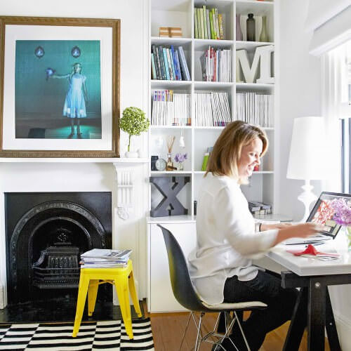
Darla Powell Interiors
"I feel like Black is going to make a HUGE impact in 2018. I like Benjamin Moore's Universal Black 2118-10. I have attached an office I did recently with this color. I have been getting a LOT of requests for Black kitchens as well."

Diego Correa
Diego Correa Interior Design
"When trying to predict what colour or colours are going to be predominantly used in a year one looks to different areas: Specialized companies that propose a colour like Pantone, experience in the dynamics of fashion and interiors and finally instinct.
In terms of Pantone, the colour proposed this year is Ultra-violet 18-3838.
In terms of fashion and interiors (specifically shown in the use of fabrics) the use of bold colours will be a constant this year.
My instinct tells me dark and bright Blues and Greens will be the colours we are going to see the most in 2018.
Both of them are beautiful colours which offer a relaxed, vibrant and seductive feel not forgetting their intrinsic connection with nature: water and earth.
For these reason, I would say the colors I see being predominant is the Dulux Blue Cod. 96BG 20/413 and the Dulux Green 30GG 21/423."

Blanche Garcia
B. Garcia Designs
"Honestly, we have been getting a lot of requests for Black, and Black paired with Stone colors; Black bath and kitchen fixtures especially, and in a Matte black finish, not with sheen. Even from what we have seen in the market places."

Denise McGaha
Denise McGaha Interiors
"I love the bold, glossy color of Green, and I predict we will see it in everything from fabrics and wallpaper to cabinetry and furniture. I like Calypso Green (2046-10) from Benjamin Moore."
Mary Douglas Drysdale
Drysdale Inc.
"My selection from Pantone is color number 658"
Gail Green
Gail Green Interiors
Pantone Color - 2727C.

"Adding instant drama to the neutrals that have populated our interiors for the past few years, or as a standalone color anchoring a room with luxury, depth and subtle vibrancy, Benjamin Moore's Slate Teal 2058-20 is my pick for 2018! Almost a neutral itself, it accents perfectly the shimmer of Metallic Gold tones and pairs beautifully with the forecasted bold and bright palette on the horizon."

Tania Bell
Greenroom Interiors
"I believe the colour palettes for this year are going to remain very murky and earthy. With the re-emergence of terrazzo and terracotta into materials, finishes and homewares, I think that will greatly influence what people will want to surround themselves with. So I predict Dulux Red Ochre A157 to be a favoured colour. It is rich and earthy and teams well with greens and neutrals also"

Sacha Berger
Honeybee Interiors
"Lavender is certainly my colour of this year. From Benjamin Moore range I would say- Inspired. I am definitely loving using a dusky Lavender in my current schemes and think its a step on from the Dusky Pink of last year. It's a really soft hue and blends in perfectly with warm Greys and Stones. In my latest project, in the Grade I St Pancras station which are now luxury apartments, we have used touches of Lavender throughout and this has created a calming soft palette without being too bland. Its a gentler and more neutral take on Pantone’s Violet colour of 2018."

Daniela Nuila
Mint Decor Inc
"For 2018 I think we’ll be seeing lots of Interiors featuring various shades of Lavender and Orchid combined with Metallics. Anything from Rose gold to Silver or Copper, combined with the perfect shade of elegant Lavender will be a must! The shade I think will dominate this year is: Benjamin Moore’s “Hydrangea” #1390. It is a gorgeous shade... not too pink, not too purple- just right in every way."
Sonnia Orellana
Sonnia Orellana Interior
"During 2017 I used deep Blues in most of my projects and now for 2018 I am making a little twist towards teal blue like my chosen color 6496 Oceanside from Sherwin Williams. This colour is great to blend with shades of Light Green and Pinks. It's luxurious, sophisticated and trendy. Great with Gold or Copper accessories and medium wood tones."
Julia Mack
Julia Mack Design
"I am finding that my go-to colour for 2018 is one that forms a soft baseline; a gentle and appealing warm Taupe, so Pantone 9084-U is my choice. It is a tonal Gray that brings out the very best in neutrals like Off-whites and Blacks but also works beautifully with Blues, Greens, Pale Lavender, Pink and Peach. In a public space like a hallway, it stands on its own creating a moody backdrop but in more intimate spaces, its cosy and quite sublime, never too dark nor too bright."
Amy Kalikow
Amy Kalikow Design
"I feel that neutral, earthy colors will dominate for 2018. The softest shades of Blush, Sage and Violet and dark earthy, moody shades of Charcoal and Crimson. Benjamin Moore Black Beauty 2128-10 is a striking, bold color that can be coupled with beautiful deep Reds or electric, sparkly Greens."
Elisabetta Rizzato
ITALIANBARK
"The colour I'm choosing is Nile Green (Pantone 14-0121 ) It's a very fresh and relaxing light green and as I've seen a lot of light greens like Sage and Celadon lately, after years of Dark Greens on trend, I'm betting on this. It is perfect with greeneries and neutrals, but also matched with the bold colors that are trending now like, of course, the Pantone UltraViolet"

Patti Johnson
Patti Johnson Interiors
"It is my professional opinion that Blues remain strong, but not as deep a hue as in prior years, one that can easily be combined with the Pantone color of the year 2018, Ultra Violet when used as a lighter hue. PANTONE 19-3830 TPX This color will remain strong"
Sara Mattar
bysaramattar Design & Styling
"I think Purple & Plum are making a strong come back; for contemporary Interiors, and elegant material selection, I would pick a washed /deep tinted Taupe in purple tone"
Tracey Cooper
Lucia Victoria Interiors
"Sage Green and Navy Blue will be the biggest trend for 2018. Both colours are sophisticated and dramatic. Green is an extremely healing colour, and Blue is natures colour for water and sky. These two colours make a statement. The little Green Company Sage Green 80 and Royal Navy 257. Both colours can be added to walls or as accents of colour through sofas, chairs, plants and cushions."
-
SAGE GREEN 80
#78805E
-
Royal Navy 257
#2E4455
Robyn Hawke
Inspired Spaces
"I am finding it hard to narrow it down to just one option as I find there are the two extremes, the soft pastel/ grey hues such as Dulux Unforgettable SN3H5 which gives a hint of colour on the wall rather than dominate and the total opposite where strong, bold statements being made in bedrooms and formal rooms. In this scenario, Murobond Oyster Grey is amazing, especially paired with a White. It creates a sense of drama and sophistication, yet is a colour that can be accessorised with a myriad of hues, a perfect backdrop palette to showcase artwork, furniture etc."
Ellie Bradley
Atelier Lane, Interior Design & Decoration studio
"Here are my three favourite colours that I am using quite a bit in my projects at the moment."

Emma Brunckhorst
EMMA B. HOME
"I call this year’s colour scheme NEO-ART DECO. Strikingly bold Saffron, contrasting with powdery, creamy Rosé and tan colours. A cold, deep and royal Blue to highlight. We are heading back to strong, streamlined shapes and large-scale patterns. Don’t be afraid to use blocks of colour, lacquers and bold geometric shapes."
-
PANTONE
15-0850 TPG
#D5AE41
-
PANTONE
17-1341 TPX
#CE806C
-
PANTONE
16-1511 TPX
#CF9693
-
PANTONE
PQ-2765C
#201547

Adetee Sawhaney
Altus Interio
"The two colours that instinctively and almost naturally get drawn to are Salmon Pink and Silver Grey. Soft Salmon Pink exudes delicacy, a feeling of charm, understated elegance, is playful, uplifting and above all the colour closest to beauty. Silver Grey, on the other hand, evokes a sense of luxury, glamour, regality. The two colours when used together complement each others beauty, thereby uplifting not only your senses but also the luxury quotient in your living."
-
PANTONE 429
#A2AAAD
-
PANTONE 678
#E3C8D8
Anna-Carin McNamara
ANNA CARIN design
'Burnt Orange'

Nisrine El Lababidi
Harf Noon Design Studio
PANTONE 19-3830 Astral Aura
"With the colour trends moving towards warmer tones and with Ultra Violet being announced as the colour of the year, in interiors, I feel that a colour like Astral Aura will be a trending color due to its charm and tone. It is immediately captivating especially if used on a big wall. It goes beautifully with metal accents and with earth tones like Nudes, Brick and Citruses as well as pastels and cold tones of Grey, Blues and Greens."
Talie Mole
The Urban Mole Limited
As an Interior designer, my heart sank a little with Pantone's choice for Colour of the Year 2018 – ‘Ultra Violet’. I then remembered I had the same reaction to last year’s choice – ‘Greenery’. I am not ashamed to admit, I did a complete U-turn when I saw homes everywhere re-introducing plants and “greenery.” So cheery and an affordable way to give your space an instant face-lift
I’m still struggling with the harshness of this year’s choice, so I have chosen a colour that is a darker and more muted version and unlike UltraViolet, will definitely have longevity. Combining this dramatic colour with more organic colours gives a feel of calmness and will also compliment those plants that you already invested time and money in.

Alena Chikurnikova
AlenaC Design
Sky gray 14-4504
Eily Roe
Eily Roe Interiors
"My choice for Colour of the Year 2018 Pantone 17-1052 TCX Roasted Pecan is a little offbeat but a terrific backdrop for Black Metal & the vibrant Blues and Greens abounding. This colour evokes the comfort of an old leather chair in an eclectic family home or a striking exterior paint colour that is warm, natural yet also contemporary"

Jennifer Woch
House of J Interior Design
"This is the colour that I think will be everywhere this year! PANTONE 626 C"

"Pantone announcing Ultra Violet as the colour of the year 2018 has opened the doors to the use of Violets and Purples this year. My choice is Pantone 513 C, which is a warmer, reddish shade of Purple. It has the rich, royalty of Violet with the bright fun of Red. I have been using it on my website for a while now, and look forward to using it more in home interiors this year!"
Nina Santamaria
Grupo Santamaria
"I think, with the Scandinavian trend still going strong, that blush and neutral colors will still be the most-used interior hues for 2018. This is still very pleasing to the eyes especially when paired with extreme shades of wood: either very dark or very light for that modern twist. Any in-between shade might not get you as much striking results. With the proliferation of so many co-working spaces, boutique hotels, and stylish cafes, shades similar to PALE DOGWOOD (Pantone 13-1404) are very much one of our color go-to's in creating bright & airy interiors without feeling too cold. In the home, it adds a touch of cosiness and chic even to the most minimalist spaces. In commercial and retail projects, it registers well in photos for that perfectly 'grammable shot. '"
Lauren Gilberthorpe
Lauren Gilberthorpe Interiors
"2017 was the year of pretty much every shade of Grey, it continued to be the safe, go-to neutral and an easy option for creating a simple but stylish space. However, I think 2018 will see the comeback of warmer neutrals. It’s predicted that homes will be filled with more natural finishes and a focus on texture through natural materials such as wicker and rattan. Neutral colour schemes create a great canvas for adding lots of detail through shapes and interesting accessories, lighting and soft furnishings. If I had to choose one favourite warm neutral shade, it would currently be Salt IV by Paint and Paper Library."

Aamrapali Bhogle
NORTH LIGHT
"In 2018, we see our signature Whites and Metals being interspersed with exclusive jewel tones like Pantone {17-1635 TPX} , {17-5735 TPX}, {18-3218 TPX} and {18-3838 TPX}. Pantone's Colour of the Year being so well publicized, jewel tones in Purple and Violet have newfound liking with clients."
-
17-1635 TPX
#D85863
-
17-5735 TPX
#00926A
-
18-3218 TPX
#7E5581
-
18-3838 TPX
#645394

Fleur
Fleur Ward Interior Design
"This colour is a personal favourite, but I’m seeing more of it coming through in interiors and fashion right now.. .Malachite Green. Pantone 3522 CP"
Loretta J. Willis
Loretta’s Interior Design, LLC
"In my design opinion, I believe warm neutrals will continue to dominate in residential colour design and I choose Pantone’s Simply Taupe (16-0906 TPX) as Color of the Year 2018!"

Anushka Contractor
Anushka Contractor
"This year I see colours of Gray – PANTONE Cool Gray 4 XGC as a neutral background along with accents of Blue – PANTONE 18-4026 TPG Stellar & contrast of Tan – PANTONE 16-1149 TPX Desert Sun"
Kathryn Marsh
Kathryn Interiors
"A charismatic color, Sherwin Williams’ Oceanside SW6496 is a saturated Teal color that will be seen in interiors in 2018. Oceanside is a blue-green jewel tone hue; this color is a perfect balance between Blue and Green and radiates a cool and serene atmosphere in any space.
Perfectly at home in different interior settings from casual, to eclectic to elegant. Make a bold statement by painting walls this sophisticated color, combine Oceanside with Black for a striking look, complete a space by adding this stylish color in accessories."

Donna Jones
The design option
PANTONE 18-1248 TPX Rust
"The soft dusky Pinks have moved more into the peachy and rust tones that work so well with the dark inky Blues that have been so popular."

Victoria Nickolls
Victoria Nickolls Ltd
"With it being announced that this year’s Pantone of the Year is Ultra Violet, I believe we will start to see versions of it being introduced to interiors but in more of a refined way, with slightly more muted tones including lots of berry type hues and even Dark Rose. Pared with Brass and other Jewel type colours such as Teal, this colour would create a subtle yet refined look."
PANTONE 14-1905 TCX Lotus
PANTONE 17-1512 TPG Nostalgia Rose
PANTONE 18-1716 TPX Damson
-
PANTONE
14-1905 TCX
#E2C1C0
-
PANTONE
17-1512 TPG
#A57D85
-
PANTONE
18-1716 TPX
#7F4D64
Renata Pfuner
Pfuner Design
"Our approach to Interior Design is based on holistic principles. One of the most important elements is color and their effect on our mind, body, and soul. 2018 will see a gentle revolution in society, and this will reflect in interiors that are calm, nurturing with the aim to support our spiritual well-being. Shades of Green balance Yin and Yang; they help up to relax, slow down, and reconnect us with our inner power.
The color Green can be incorporated into interiors through plants, botanical wallpapers, or accent pieces such as furniture or decorative art. My choice of Green for 2018 is Pantone 18-5338TPX - named Ultramarine Green. This shade is sophisticated but at the same time vibrant and collected; a perfect accent color for neutral interiors. It can be easily combined with shades of red and yellow to enhance the vibration."

Ruben Rossouw
Block Plan Architecture and Interior Design
"This year I suspect we’ll see a lot more moody colours with dark undertones used as ascent colours in combination with neutral colours. My favourite at the moment is St Charles Street. A rich colour like this, combined with monochromes and earthy materials and a great indoor plant selection, will make any room stand out."

Eileen Rivera Esquilin
Mikosmos Interiors
"Bright colors are always a good opportunity to highlight the spaces. And main painting houses present us every year with tempting ideas to create accents or focal points.
While Benjamin Moore launches an interesting proposal for 2018 with “Caliente” - an intense Red that looks good both with the palette of neutral Gray that are so ‘trendy’, as with the creamy / earth tones for the most classic, the reality is that it is a daring tone, which not everyone decides to use.
I bet more on Sherwin Williams ‘Oceanside’ (SW6496). It's a Blue-Teal that I like a lot, that can give a 'pop' of color to a variety of spaces and brings drama. It is a versatile hue that can be as elegant as casual, as feminine as it is masculine. It also lends itself to be use in many decorative styles. It would take ‘Oceanside’ to a back wall, in bedding, on a rug and even in the upholstery of an armchair.
I think "less is more" ... so if we are frequently changing the setting of the spaces, it’s better to use these ‘trendy’ colours with some restraint, so frequent changes will be easier and cheaper."
-
Caliente
AF-290
#7E2B2B
-
Oceanside
SW 6496
#015a6b

Ania Trica
Trica Design Studio
"This year we will see more Blush Pink hues emerging especially in retail interior spaces, last year people were still a little afraid of using this colour, this year we will see more people taking colour risks. Forest Green will also be on the rise, especially in hospitality spaces and in bathrooms. We will continue to see Gray,however, residential spaces will opt for a more subtle and soft contrast, we will see light gray or bone coloured walls paired with soft white trim and panelling."

Erica Matthew
Funk Studio
"I was sitting in bed thinking about what colour will be the one for 2018, and I kept having visions of a Purple (which has alway been one of my favourite colours), and I hadn't even checked out the Pantone colour of the year yet... So when I got up and started looking for a Purple colour on the Pantone charts, I was super surprised to see that Ultra Violet is the 2018 Pantone colour of the year. And it was the perfect colour Purple too!
So here are my choices..."
-
PANTONE
19-3750 TCX
#3E285C
-
PANTONE
18-3838 TPX
#645394
-
PANTONE
14-4103 TCX
#BBBCBC

Zahra Ahmed
Studio Red Interiors
"I strongly believe Grey tones would be dominating this year around."

Maria Gabriela Mendoza Baez
MG Interior Design
"In my opinion, the colour of the year remains to be those that will allow us MINDFULNESS in our spaces. Therefore this is my selection:"

Rochelle Cote
Rochelle Cote Interior Design
"We personally think that the dark rich tones are coming back this year. We love Sherwin William's Oceanside SW6496 and Benjamin Moore's Salamander 2050-10 and are implementing these fabulous colours into our showhomes."
Sasha Bikoff
Sasha Bikoff Interior Design
Sasha's favourite Pantone colors that she’s expecting to be huge in 2018 interiors.
"Saffron
I have always wanted to do a saffron colored room. It’s such a warm, interesting and exotic color and I think it takes you to the Far East which creates a romantic worldly setting.
Chartreuse
Chartreuse - it is a groovy 70's color that seems to be making a comeback because people are really into this vintage retro look now and bringing more color into their homes. It is not too bright but also not too muted so it makes for a warmer green tone"

Tami Jones
Tami Jones Interior Designer
"I love that bright, vibrant color is making a comeback. I really see Blue as the new staple color and the Blue-Green colors edging their way into the forefront. My top picks for this trend are Benjamin Moore’s “Pacific Ocean Blue” 2055-20 and Sherwin Williams “Green Bay” SW6481 for interiors. I love how they bring a little life while working well with other popular bright hues and of course those wonderful neutrals that I don’t’ see going anywhere soon."
Linda Allen
Linda Allen Designs
"I’d like to use 2018 Pantone Almost Mauve - 12-2103 TPX - RGB 235, 225, 223."

Maurizio Pellizzoni
Maurizio Pellizzoni Ltd
"Ultra Violet PANTONE 18-3838 has been selected as PANTONE Colour of the Year for 2018 and the use of Purple will flourish in interiors, from small accents to large feature walls.
Following last year’s ‘Greenery’, like foliage, it's still very much on trend and will be seen in homes for some time, but with the addition of more use of strong, solid colours.
PANTONE 5395 U is a Blue Black colour and will be a popular key colour for 2018, especially in kitchens. Combined with metallics like polished Brass, it can add a luxurious feel to any interior from upholstery to woodwork. This colour can be used with a statement piece or even to dominate a room with walls painted in this sophisticated tone. This Deep Blue will work well with Ultra Violet as well as pastel hues that are still very much on trend."
Josie Abate
Ambience Design Group
"For 2018 we see these two powerful colors dominating home interiors – Scarlet Red and Navy Blue. Energetic and passionate, the allure of Scarlet Red is undeniable, and Navy Blue has always been a versatile and timeless crowd favourite. As bold and captivating as Scarlet Red might be, this color needs to be used thoughtfully. One way to decorate with Scarlet Red is to use it as focal point in the room such as in drapery or small décor pieces.
Be sure to use plenty of neutral color throughout the rest of the room to keep the Red toned down - and what better “new neutral” than Navy Blue. Navy is an elegant shade that works well with just about any color and brings class to space, no matter the style
"

Nora Dieppe
Dieppe Design
"Lavender has been a hit with many designers on the 2018 fashion runways, along with many neutral & pastels. Pantone has also selected 'Ultra Violet' as their colour of the year. With this in mind, I predict that hues and shades similar to Pantone's 'Lavender Frost' 15-3507 TCX will frequently be seen in interiors this year."
Jane Cameron
Jane Cameron Architects
"Pantone Dusty Pink will dominate interiors for 2018, by bringing a lovely feminine warmth to a space."

Anita Oakey
Aoki Interiors
"I can see a colour such as the Farrow and Ball Cinder Rose 246 being the favourite of 2018 and beyond it is such a warm soft colour and blends well with the Greys that have been a favourite for the past few years, adding Cinder Rose will make it seamless to keep those interiors up to date with ease."

Ines Mazzotta
Kelly Hopter Interiors
"Although I don't think we're quite ready to let go of Grey Blues and Navies just yet, I believe 2018 will see the rise of what I call Heritage Greens. Unlike their saturated cousins, these greens are muted with dusty undertones, making them very liveable and comforting - reminiscent of a cozy English country home. We've already seen some beautiful spaces utilizing these hues emerging over the last couple of years and I see this direction gaining momentum in 2018. We are currently working on a kitchen that pairs beautiful Heritage Green cabinetry with creamy Whites and warm woods for a quietly elegant and deeply satisfying result."
-
PANTONE
5467 CP
#233B37
-
PANTONE
560 C
#1D3C34

Jackie Funkhouser
Scottsdale Interior Design Group
"Our choice for the colour trend for 2018 is Tiger Lily"

Lauren Clement
Lauren Nicole Designs
"I love the classic color of Navy and I believe that Pantone's Navy Peony is a perfect example of what to look for in 2018. This color would be beautiful on cabinetry; Think Island or even perimeter space in a kitchen or even an office. And in a lacquered finish it would be fantastic. Navy Peony is also the perfect pairing with the ever-popular shades of Gray or even the more tans or shades of Greige. Navy can also be a compliment to tones of greens and pinks making it a popular color for print fabrics. You'll see Navy throughout my portfolio and I plan to grow it's appearance in 2018."

Trudy Jordan
Trudy Jordan Design
"I think this year will be rule by a contrast of a trio of colors.
1st trio
17-2808 Ballet slipper
17-1818 Red Violet
19-1725 Tawny port
2nd trio
19-4524 Shaded spruce
16-0543 Golden Lima
15-0751 Lemon Curry"
-
PANTONE
13-2808 TCX
#EBCED5
-
PANTONE
17-1818 TPX
#A65E7E
-
PANTONE
19-1725 TCX
#5C2C35
-
PANTONE
19-4524 TPX
#005960
-
PANTONE
16-0543 TPG
#9C9A40
-
PANTONE
15-0751 TPX
#CCA01D

Shannon Ggem
Ggem Design Co
"Many of our younger clients are asking for the perfect Yellow. I love Benjamin Moore’s Marblehead Gold HC-11. It feels earthbound and classic. Shannon Ggem, Ggem Design Co, Los Angeles"
Tricia Cunningham
Tricia Cunningham Interiors
"For me, deep Blues are still going strong but I'm also very drawn to dark Greens and I'll be using more of them this year. I like to think I'm not overly influenced by trends, but we all are to varying degrees. When I design an interior, I expect it to look good for many years and using colours well is key to ensuring that. My heart used to sink when a client would ask for a colour I didn't like, but these days I rather relish the challenge of incorporating it into a scheme in a way both the client and I will love. In my hunt for lovely colours, I found these two gems: Benjamin Moore's Polo Blue (2062-10) and Little Green Paint Company's Invisible Green (56)."

Marina Klima Goldberg
My Decorating Tips
"I see much more drama within fashion and design world in terms of color. It has been all about bold, brave strokes. No more timid, insecure neutrals. Don't get me wrong, I am not against neutrals, but I see more juxtaposition of light and dark everywhere. Plus, we are so vested in a healthy lifestyle, mind and body connections, as well as our deeper understanding of being part of nature. I would say hunter green has to make a comeback!"
Brandi Becker
Indi Interiors
"My colour choice for 2018 is dark Aubergine/ Pantone 7449. I am finding my clients are over the crisp whites and neutrals and want more of a moody look."

Camilla Molders
Camilla Molders Design
"I often to look to Navy to use in my work as it is a colour that can lend itself to most situations. It can be a powerful colour to use individually but also works beautifully alongside brighter colours when I use it to ground the design. I love Light colour Navy Classic as it has just a little kick, and dark navy for a more solid ‘Im here’ kind of navy!"
-
PANTONE
274 C
#211551
-
PANTONE
2765 C
#201547
Anna Cuthbert
Cuthbert Interiors
"Moving from the fresh greens of 2017, I find myself using more Moody Blues and dusky Lilacs. Mixing colours of subtle hue create a moodiness and ambience which invites and cocoons"
-
PANTONE
7696 C
#6399AE
-
PANTONE
678 C
#E2C9DA

Danny Russo
SRG // INTERIORS Inc
"I really love Sherwin-Williams as my color source… Right Now…
Caviar(6990) is my go-to Black… I love the hues brought out by its natural character… It’s great on a ceiling and as an accent. Any black is timeless…used correctly it elevates any space.
Daffodil (6901) has been intriguing me. I’ve seen it pop out at MKT’s the past few years. Use it sparingly…makes a great impact on dark colors.
Commodore (6524) is a Dark Blue that always works great in any room with neutrals. It’s the color of a fine suit…Works well with Blacks and Grays!
YUP…Black and Blue work together amazing these days. I’ve been seeing and using them since ‘14; Seeing the combo in cars and clothing a lot lately.
Still, the go to “NEW” neutral… is Greige…Not new to the design world…We’ve been doing it since 06…But you get it now! And you love it…Right?
Perfect Greige (6073) is my favorite with Versatile Gray (6072) as my runner-up. These should be your base colour to build from unless you are bold like me and go with a deep Black, Blue, or any other colour you enjoy!
My friends in the U.K. can match these suggestions up to any Farrow & Ball Paints…I love my British friends and family! Farrow & Ball is my go to paint in the U.K.!"

Darren Au-Yeung
Darren Design & Associates
"I think the colour trend in Hong Kong in 2018 would be Dark Blue with a touch of Turquoise. My favourite choices are Pantone 2377 U and Pantone 550 U"
-
PANTONE
2377 U
#57697B
-
PANTONE
550 U
#7AAABE

Minhnuyet Hardy
Minhnuyet Hardy Interiors, LLC
"I believe Black will be the 2018 color of the year. Several rooms in my newest projects are painted a shade of Black. The result is a room filled with contrast and is oh so dramatic. People are typically afraid of this bold color choice but I think that once they see how warm a space can look, it will become a fan favourite."
Katherine Gordon
Katherine Gordon Artwork
"I had to analyze about it for a few days, but here is my prediction for the colour that will rule in 2018"

Olga Gomes
OG Design Studio
"Shades of Grey and White interiors are still a strong statement for 2018. However, I’ve started pushing for some colour! With Pantone’s colour of the year (Ultra Violet), a little purple goes a long way. So my choice to bridge the gap is Benjamin Moore’s Excalibur Gray. It’s a soft Violet/Grey that is pale enough to soothe and bright enough to hold your attention. It looks great with natural or greyed-toned woods, an important new trend in our projects going forward in 2018. Combine this colour with soft Blues, a variety of Whites and Pale Grays, and you’ll achieve a relaxed look that is more than just Gray."

"I think Pantone’s Blooming Dahlia is going to be big in 2018. Amongst the “50 shades of pink” we see everywhere, this subtle and interesting color with understated appeal, immediately caught my eye. It pairs well with grey, black and gold, to create a combination that willl look edgy"
Cecilia Rocabado
Cecilia Rocabado Interior Design
I think Carolina Gull will be the color for 2018, this color will illuminate your space and give elegance, this is a great complement to classic colors. You want to use it in your family room of formal living room.

Iwan Sastrawiguna
Iwan Sastrawiguna Interior Design
I think 2018 is going to be the breakout year for the colour. I love combining light purple
colour (PANTONE 13-3802 TPX- ORCHID TINT) with beige the neutral colour (PANTONE 11-0605 TPX- JET STREAM).
Lolita Freidman
Intrante design studio
Harmony – it is balance and symmetry of strength that is needed for every person. External harmony is as important as inner harmony, so creating a balance in the interior is a complex and delicate process. Farrow&Ball tones ARCHIVE, DOVE TALE and CHARLSTON GRAY – is a true reflection of harmony and peace. That is why we so often use the combination of these tones in our interiors, because they highlight comfort and give you a peaceful feel. ARCHIVE, DOVE TALE and CHARLSTON GRAY these tones will help you to reach the natural presence in your living space.
Shelly Rosenberg
Shelly Rosenberg Studio
"In an often chaotic world, we need havens that are warm and enveloping. Earthy colors like moss greens and rich gold are soulful and soothing. Deep red-browns offer intrigue without overstimulating our nervous systems. This palette is similar to the popular interiors of the 70s and 80s, but with a muddier, more sophisticated value. This grouping can easily be used together or each can be coupled with a brighter, trendy hue of your choice. Join a deep green with the latest blush pink or team gold with Pantone's 2018 Color of the Year Ultra Violet."
-
Polished Mahogany
SW 2838
#432722
-
Different Gold
SW 6396
#bc934d
-
Secret Garden
SW 6181
#4f523a

Linda Loutfi
Linda Loutfi Interior Architect
"I think we will be singing " Blue Velvet" song again this year 2018. Eye-catching and sophisticated royal blue velvet will add elegance and richness to the interior. My pick for Interior Design is the Royal Blue: Pantone 281 with mix of Greige color: Pantone 615 C"
-
PANTONE
281 C
#00205B
-
PANTONE
615 C
#D6CF8D

Aurora Rodriguez
Dawn To Dusk Designs
"Interior Design and Fashion go hand-in-hand, especially in my hometown Los Angeles, CA. Most recently the color that I see as a hot trend and do not foresee leaving us anytime soon is the glitz and glam color gold-which is associated with illumination, passion, courage, magic, love, compassion, wisdom, prosperity, royalty, and grandeur. The City of Angels is a beautiful melting pot that consists of a myriad of individuals who love to express themselves in various artistic and cultural ways. Because I see many rocking this color in various forms, ranging from the daintiest jewelry accessories, to office supplies, to interior design furniture and wall treatments, Dawn to Dusk Designs sees this timeless color as the perfect color of choice for 2018 (and years to come) that will complement any color on the color wheel spectrum, including this year’s Pantone’s 2018 Color of the Year Ultra Violet. I hope you enjoy this insight, and from Dawn to Dusk Designs to you I wish you a fashionable 2018."