Every year, the world's creative and marketing industries wait with bated breath for an important announcement - one that will affect the year to come in myriad ways, some more obvious than others.
This important forecast will affect the pigments mixed for makeup, the paint selections available for buildings and furniture, the foods bought, prepared and presented in the world's fine-dining establishments and more.
Yes, we're talking about The PANTONE Colour of the Year.
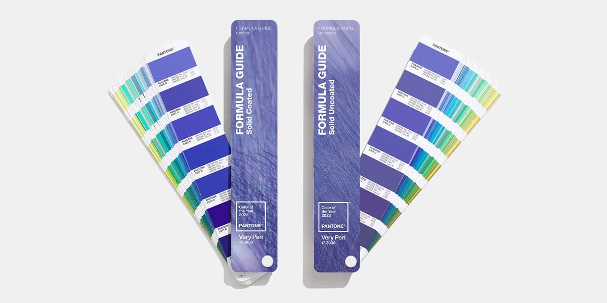
The answer has finally arrived: PANTONE 17 - 3938 Very Peri
Veri Peri is a blue periwinkle hue that's calming and comforting, rich and warm all at once. A warm blue seems like an impossibility, but the colour experts and PANTONE pushed the limits with this year's selection, making 2022's colour one of the most exciting picks of the last two decades.
At QS Supplies we're into helping you hit some serious style points when redoing your bathroom - whether it's a full renovation or a light rejuvenation, we aim to provide inspiration. But first, let's look at how PANTONE created this remarkable colour.
The Story of A New Shade

For PANTONE's 2022 colour of the year, they did something they've never done before.
Instead of choosing from one of their existing colours, they chose to create a new colour. After the last two years, PANTONE wanted their colour of choice to reflect our environment of changing opportunity and modes of expression. To do this, they added shades of violet to a periwinkle blue. In doing so they created the warmest blue possible.
Their colour seems to reflect more than just the possibilities of something new, but also an acceptance and serenity that's deeply needed in today's world. It's a lot of things at once: fluid, bold, soft, refined, unusual. And it's also the perfect colour for your bathroom.
The usual worry when it comes to shades of blue in the home is that it'll make a space feel cold or cramped. With a warm blue like Very Peri, you don't need to worry about that being an issue.
Due to Very Peri being a 'new colour', it can work with a variety of interesting palettes, samples of which are available to explore on PANTONE's website. It works as an accent that can be added in to the finer details of your decor, or as the perfect colour for a statement piece of furniture.
But there's a question you might be asking - what makes PANTONE's opinion so important?
How PANTONE Became The World's Colour Experts
In 1962, PANTONE employee Lawrence Herbert bought the company and decided to move the business' focus away from printing and toward a new industry: colour matching.
As globalisation was taking off, people expected to see the same products in different countries and expected these products to look the same. Imagine if Coca Cola was a different shade of red in different countries; the branding wouldn't be as instantly recognisable and powerful and would undermine their sales. It would also be hard to tell the difference between the real deal and counterfeits.
Recognising the role of colour in visual communication (whether in fashion, product design or branding), Herbert developed the world's first colour matching system: the PANTONE system. This meant, for instance, that a designer in Europe could give a producer in America exact printing instructions. This is something we take for granted today, but was revolutionary at the time.
This idea led PANTONE to collect, categorise and label a lot of colours. They developed further systems for digital design, pigments and even began to distinguish how a colour would look with a different set of finishes (metallic, matte, gloss etc.) When a company has that much data, the data itself becomes a valuable asset. Trend forecasters gather data and use it to predict market trends in the future. PANTONE realised they had the data and assets to predict one of the most important aspects of design: colour.
PANTONE's Color of the Year has been running for 22 years, and in that time has proven itself to be one of the most valuable and talked about annual forecasts in the design world. Choosing the colour requires a lot of work, discussion and research. The colour experts at the PANTONE Color Institute conduct meetings with artists, curators, fashion houses, designers and more to reach their conclusion.
According to an interview with Vogue, Veri Peri was inspired by gaming platforms and the metaverse and was constructed as a possible window into a strange, digital future.
Very Peri in Your Bathroom
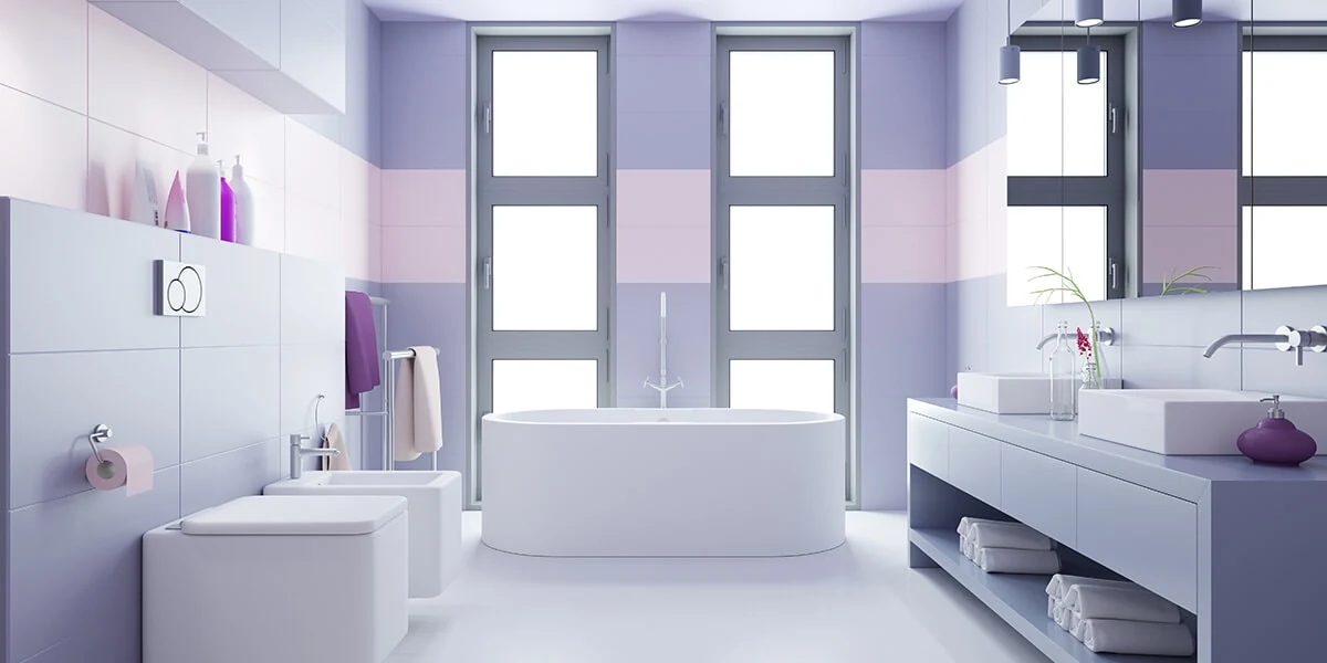
The joy of an unusual colour like Very Peri is that you can choose to make a statement and go bold, or hide it in more subtle hints and accents. Both could work very well in different ways. If your bathroom has a lot of white (as many do), the periwinkle blue will fit right in and add an modern yet artful flare to the room. Let's look at certain ways you can incorporate this fascinating hue into your bathroom.
Tiles
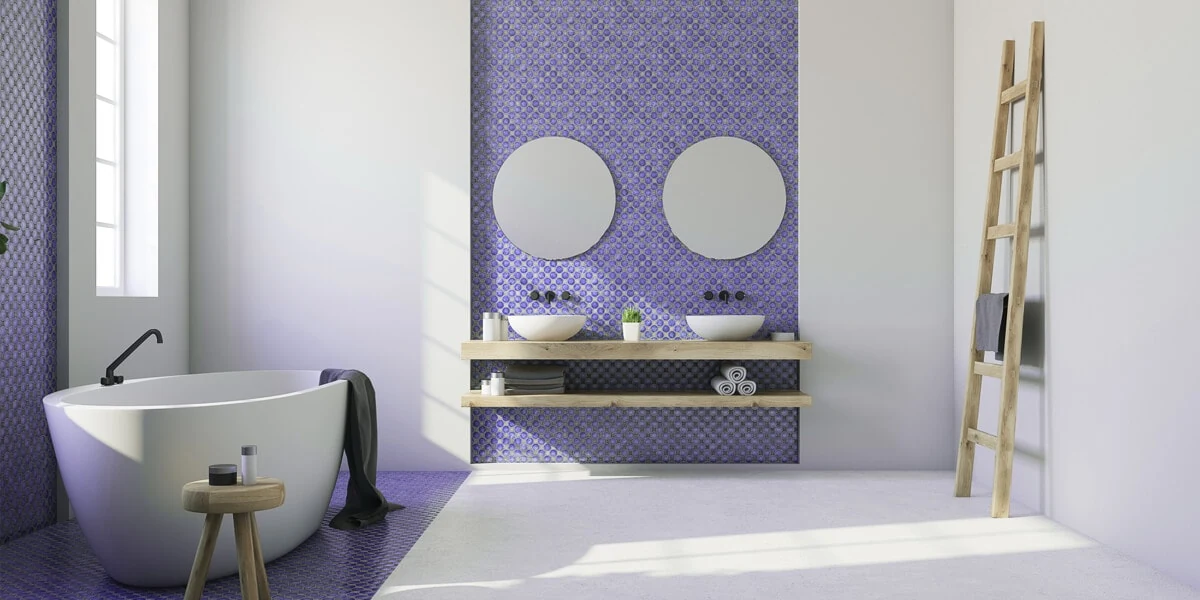
When it comes to the bathroom, tiles are the order of the day. Walls, splash boards and window sills are all places that could benefit from a bit of brightening up. Whether it's a small detail or a concrete theme, tiles in Veri Peri blue will add an unexpected warmth to your bathroom that will both soothe and energise you throughout the day.
A New Coat?
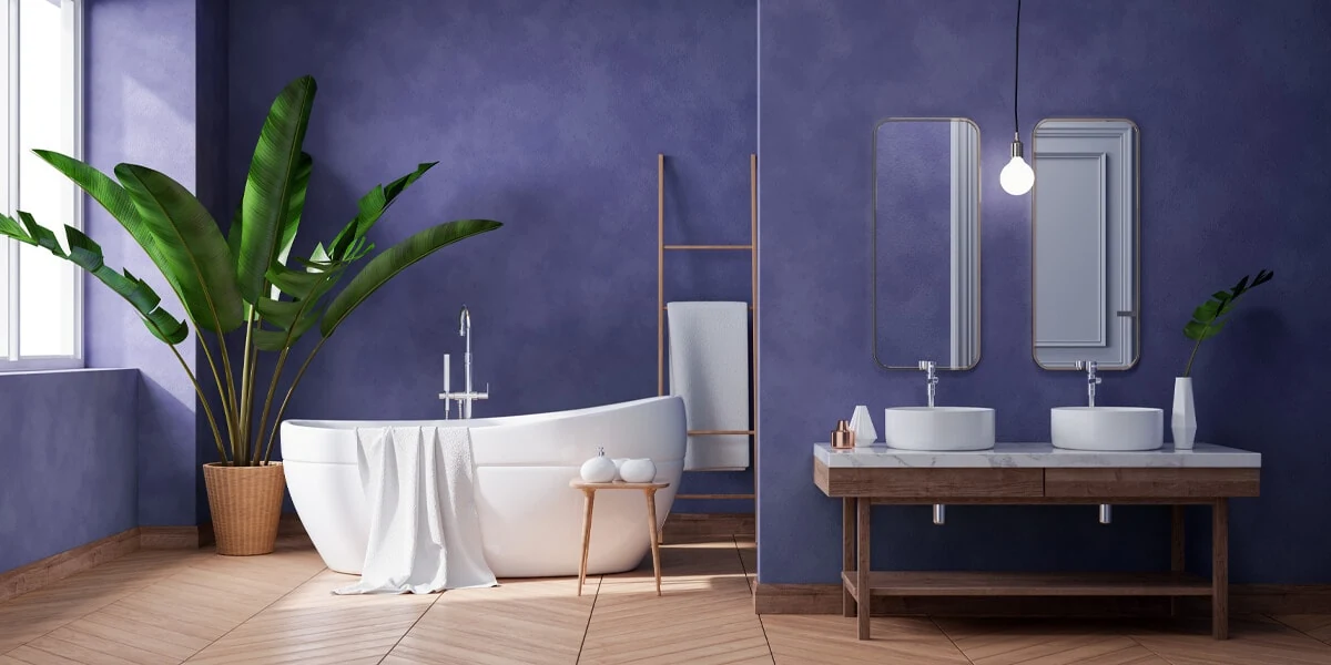
If you're looking to take the bold approach, why not break out the tray and the roller and add a statement wall. If you combine this with some clever tiling (and some healthy plants that thrive on steam), you'll have a space as dynamic as the colour itself. Remember that glossy tiles will be well balanced with a matte wall.
Accented Wallpaper
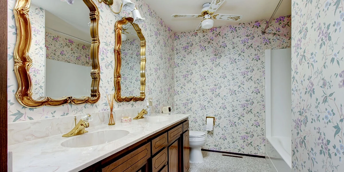
If you're going for a blend of old and new, finding a wallpaper with flares or details in Very Peri can create an elegant reimagining of retrofuturism for the modern era.
According to PANTONE's Wellspring Palette (one of the four palettes released alongside the Color of the Year), Very Peri Works incredibly well alongside PANTONE 17-0949 Chai Tea - a warm tan that's featured in many classic wallpapers.
Breath New Life into Your Vanity Unit
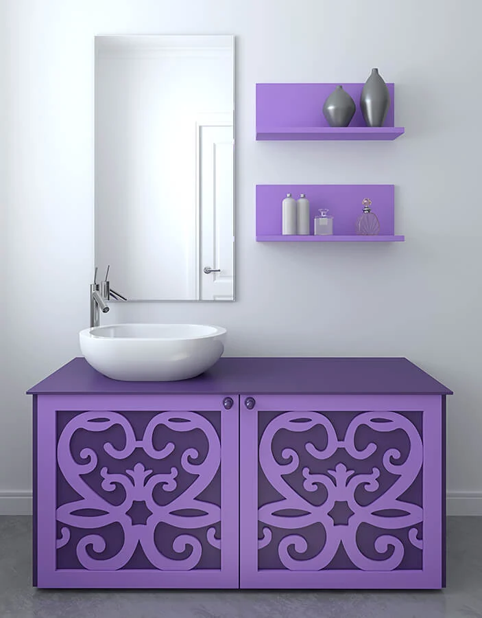
If you've decided you want to get your hands dirty but aren't committed to an entire statement wall, get a well-respected paint store to mix a PANTONE-inspired chalk paint and spend a weekend repainting your vanity unit. The wonderful thing about chalk paint is that it comes with a variety of possible finishes and can be applied to wooden furniture without prior sanding (which can be a hassle).
Very Peri Accessories
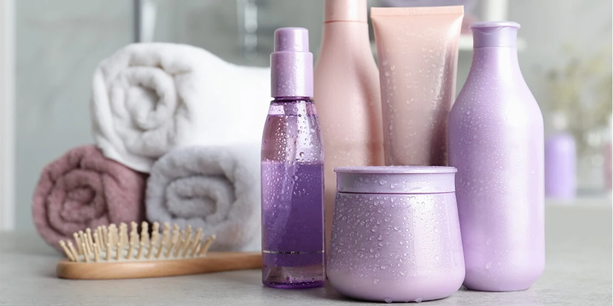
Another way to quickly add pops of this on-trend colour to your bathroom is to find a collection of accessories that work together to deliver an elegant, understated accent to the space. Think candles, clay vases, ceramic toothbrush holders, mirror frames and so on.
Find Complementary Shades with PANTONE's Palettes
As discussed above, take a look at the four different palettes the PANTONE Color Institute has put forward alongside their Color of the Year: Balancing Act, Wellspring, The Star of The Show and Amusements.
These four palettes can help you use all of the above bathroom makeover ideas in different ways: keeping the focus on Very Peri whilst choosing tiles, accessories or wallpaper that complements it perfectly.